
Author Notes:
- Thanks to Derek Reed for alerting me to the graph featured at the end of this post.
- This is an example of what I call a “pocket protector post” — one that’s likely to appeal to methodologists, history buffs, baseball fans, and a few other types of committed nerds, but probably nobody else. You Cool Kids who are above this sort of musing are missing out on a lot of visuo-quantitative behavioral fun.
- This post is dedicated to Rickey Henderson mega-fan R.D.
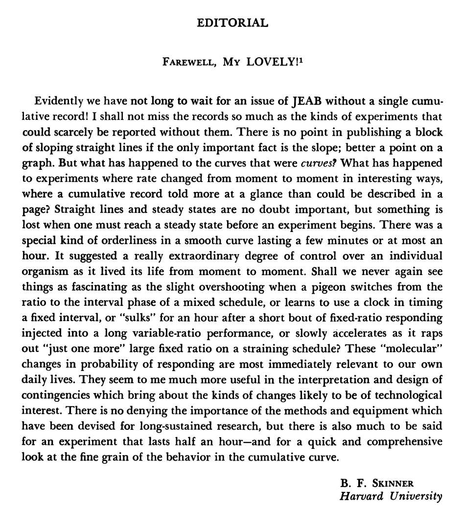
Back in 1976, B.F. Skinner published his shortest article (below; it’s not every day you can reproduce an entire article in one screen shot!). This was also one of his most melancholy pieces. “Evidently,” wrote Skinner in the paper, which was published in the Journal of the Experimental Analysis of Behavior (JEAB), “We have not long to wait for an issue of JEAB without a single cumulative record!” In his laboratory work, Skinner had heavily relied on cumulative graphs because of their capacity to capture fluctuations in behavior rate in real time — that’s where he thought the real action was to be found in behavior dynamics. He wrote, therefore, that he would miss the excitement of seeing “the fine grain of the behavior in the cumulative curve.”
Alas, Skinner was right. The cumulative record was all but doomed in behavior analysis.
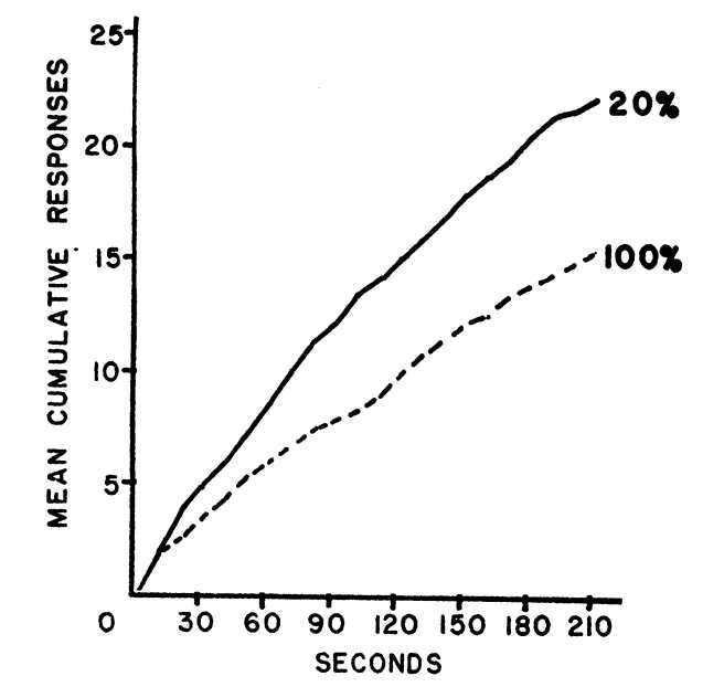
For quite a while it had dominated the science of behavior. It was the primary feature in most of the 794 pages of Schedules of Reinforcement, and, of course, it was the data display of choice in early volumes of JEAB. You could also find a fair number of cumulative records in seminal applied behavior analysis research. Here’s an example from one of Sidney Bijou’s early studies, the 1957’s, “Patterns of Reinforcement and Resistance to Extinction in Young Children.” It shows that, in children as in lab animals, behavior under extinction is stronger following intermittent reinforcement than continuous reinforcement (important because when operant research was first extended to humans nobody was sure about the extent to which behavior patterns and principles would replicate across species).
But, alas, driven by changing norms of experimental design, data-display habits evolved in other ways, and in behavior analysis the cumulative record went the way of the dodo… or perhaps I should say of the Sumatran rhino (not extinct, but barely hanging on, with 30 remaining individuals). If you want to know more about the selection pressure that drove cumulative records to the brink of extinction in the environmental niche called behavior analysis, see Peter Killeen’s lovely explanation in “Reflections on a cumulative record.”
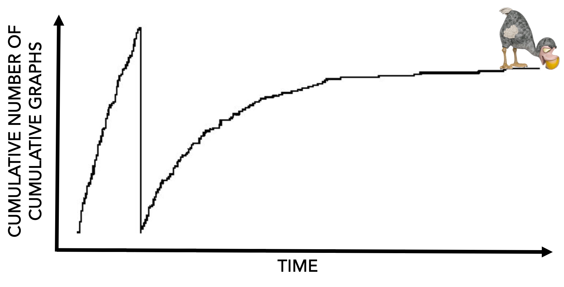
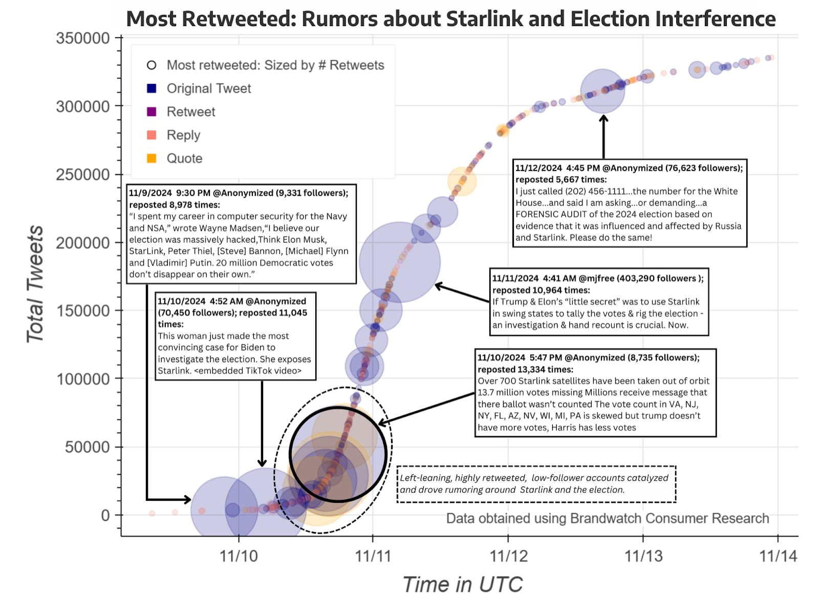
Although we’ve effectively said farewell to cumulative graphs in behavior analysis, as I explained in a previous post they’ve had a fairly robust continuing life beyond the pages of our journals. To my knowledge, only a few isolated operant labs still use the venerable old cumulative recorder device (P.S. Andy Lattal wrote a lovely “biography” of that machine in, “Steps and pips in the history of the cumulative recorder“). But cumulative graphs that any serious student of behavior analysis should recognize and enjoy are frequently used in popular media, where they are valued for their visual oomph (not just my opinion: see here). Now, copyright restrictions prevent me from showing you cumulative graphs from most for-profit publications, but here’s an example from the nonprofit University of Washington Center for An Informed Public.
Once you start noticing cumulative graphs “out there,” you may feel a bit like the protagonist of Howard Waldrop’s short story, “The Ugly Chickens,” who, following a random tip and a lot of detective work, discovers that before dodos were wiped out in Mauritius, some were exported and found their way to the New World — and might yet be alive on a farm in rural Mississippi.
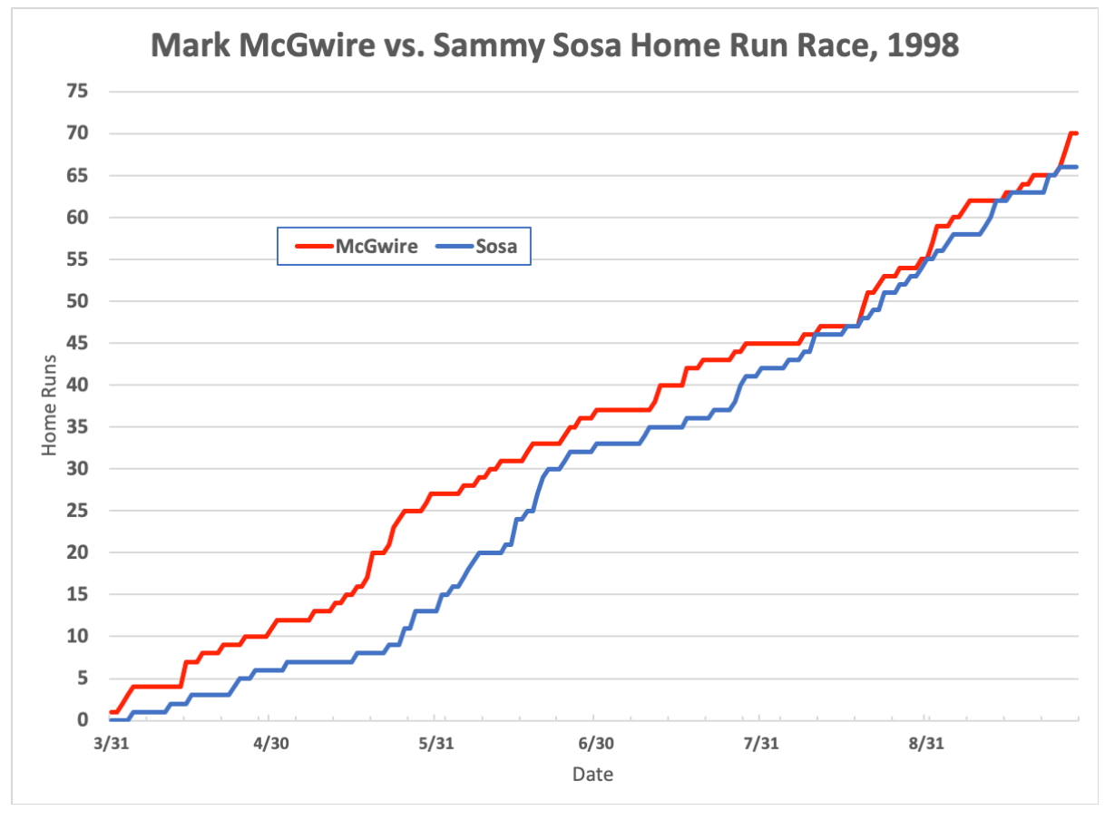
Cumulative graphs are especially useful when the focus is on comparing relative rates of two events. As an example, in my previous post I mentioned a NY Times figure (warning: paywall) showing Donald’s Trump’s rate of complaining about purported election fraud in different phases of his political career. And I reproduced this lovely summary of 1998’s race between two baseball players to break Babe Ruth’s long-standing record for home runs hit in one season.
As I wrote in my post:
You needn’t know a lot about baseball to understand “the fine grain of behavior” that excited baseball fans. Would Ruth’s “unbreakable” 71-year-old record (60 home runs) finally fall? If so, who would eclipse it first? And, who would ultimately win the suspenseful cat-and-mouse game played by Sosa and McGwire as they battled … to determine who would own the new record?
Another example of comparing rates: This summary of how the COVID-19 pandemic unfolded in various countries, from the Johns Hopkins Coronavirus Resource Center:
Just the other day, yet another great example of using cumulative graphs to compare rates popped up, this one also from baseball (which makes sense, because baseball as a cultural phenomenon is as much about statistics as skill, and virtually every aspect of baseball behavior is operationalized and quantified).
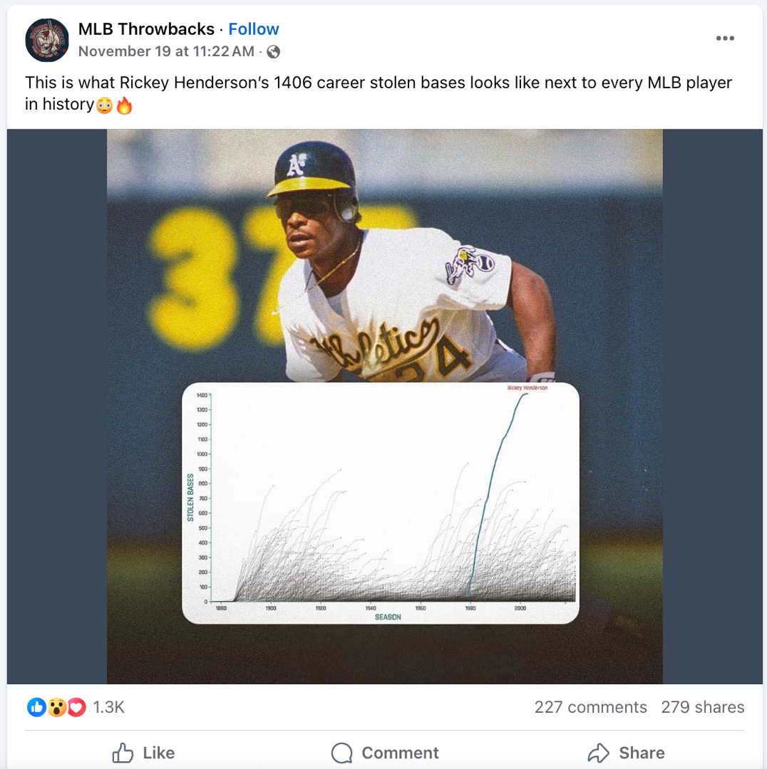
The MLB Throwbacks Facebook page featured the post at right to highlight the uniqueness of baseball’s all-time base-stealing leader, the great Rickey Henderson. In the graph (expanded below to show detail), each cumulative curve represents one of the more than 20,000 individuals who have played major league baseball. The time (horizontal) axis counts baseball seasons, and the behavior (vertical) axis counts stolen bases.
You don’t have to know baseball to see that Henderson was special. His curve is steeper than most others, showing that he averaged more stolen bases per season than just about anybody. Obviously his curve reaches higher than all the others, showing just how far his career total exceeds that of the next-best player. And a close look reveals that, for most players, the stolen-base curve is steep at first, then tails off (flattens) at the end, showing that as players age they tend to steal fewer bases in a season. By contrast, Henderson’s curve is much closer to linear: His prowess was unusually resistant to age effects.
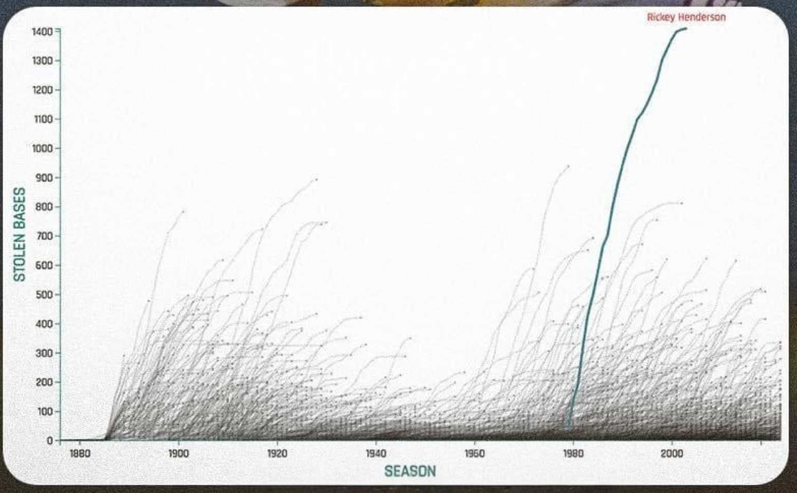
The graph also shows that there have been distinct eras of base-stealing in baseball. Base-stealing was frequent prior to about 1930, then scarce for the next couple of decades. It surged again starting in the 1950s, and began to tail off again around 2000. Whatever the reasons for this A-B-A-B pattern, you can see that Henderson played when the art of base stealing was at its historical zenith. Yet even though hundreds of players enjoyed whatever advantages this era might have afforded, he vastly outproduced everyone else.
All of that can be packed into one little graph, and stunningly conveyed at a glance, because of the distinct, intuitive communicative power of cumulative records.
Oh, and one more cool thing. Many cumulative graphs have appeared in the behavior analysis literature, but rarely do more than a handful of behavior functions appear in one figure. You’ve just had the privilege of viewing what’s likely a world record for number of cumulative functions in a single graph. It’s even possible that this one panel contains more cumulative behavior functions than in all published behavior analysis articles combined. And it still works. Lovely indeed.


Pingback: Interesting Somethings (2023-2024), Indexed – BEHAVIOR ANALYSIS BLOGS