I had started working on a post about sustainability careers for behavior analysts, and I will come back to that at some point. Meanwhile, let me share some of the graphics I use in my climate talks to help convey the urgency of the climate crisis. Part 1 presents temperature and greenhouse gas data, while Part 2 will look at the existing financial and health impacts.
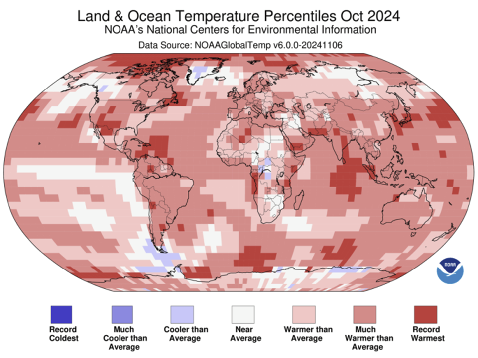
https://www.noaa.gov/news/2024-was-worlds-warmest-year-on-record
2024 was the hottest year on record, globally. Before 2024, 2023 was the hottest year on record. And so on. We keep setting records.
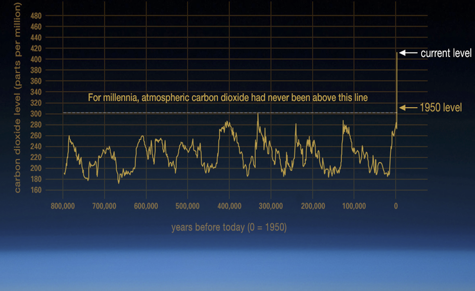
The science behind anthropogenic climate change has been well established for decades at this point. In my outreach, I still sometimes hear that our current greenhouse gas and temperature levels are just part of a natural cycle. No. Among the extensive evidence disproving that claim is this *800,000-year* graph of atmospheric CO2 levels from NASA:
https://science.nasa.gov/climate-change
These data are from ice cores. They kind of whang you between the eyes, don’t they.
Finally, from the Intergovernmental Panel on Climate Change’s (IPCC) sixth assessment report of 2023 (a free download with an executive summary), this graph shows global greenhouse gas emissions since 2000. Everyone’s hoping they will peak in 2024 or 2025, then start decreasing quickly. But in order to stay on track for a limit of 1.5 C warming, that corresponds to a 43% decrease by 2030, compared to 2019. We are not on track to cut greenhouse gas pollution that quickly. But it’s still possible. And the benefits for doing as much as we can, as quickly as we can, are well established. 1.6 C is better than 1.7 C.
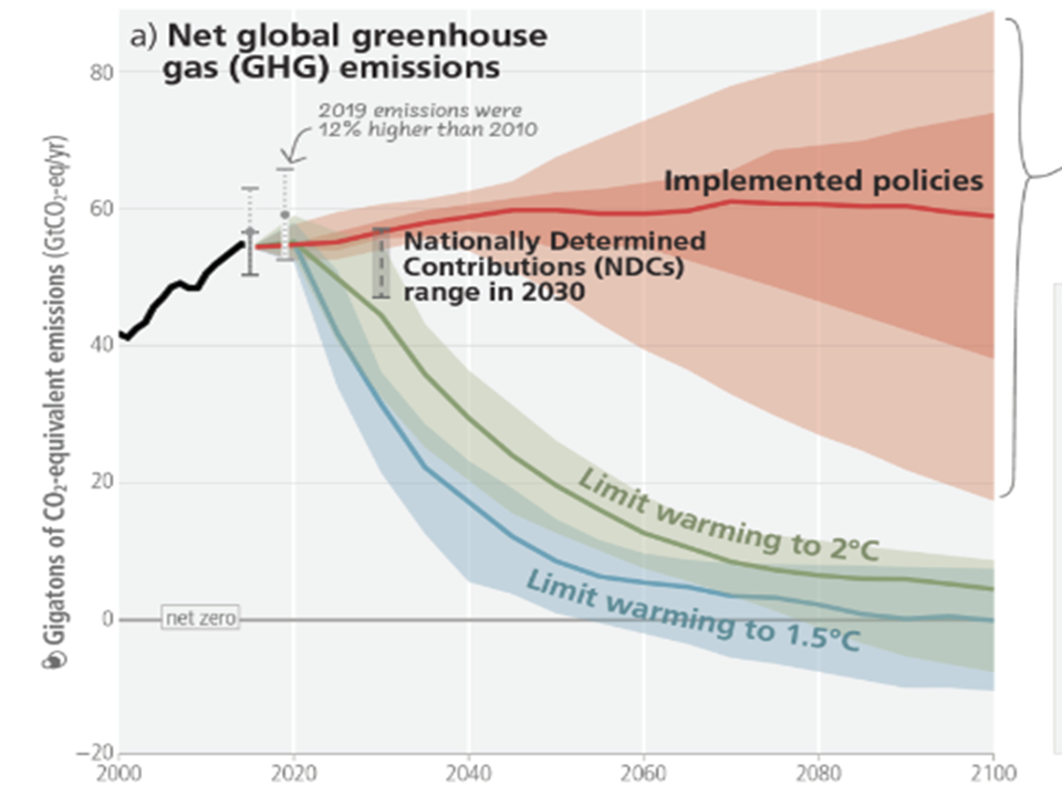
The Nationally Determined Contributions show where we could get in 2030 if all the nations that signed on to the Paris Agreement in 2015 (and nearly all nations did) meet the goals they set for themselves. It helps. But it’s not enough.
The impacts are already bad now… especially in the places that did not cause the problem. See Part 2.